The Vibrant NYC in 2019: Mapping Street Trees' Blossoms and Defoliation
In my second year living in New York City, I experienced something I’d never seen growing up in southern China and sunny California—true seasons. Autumn exploded in color, and spring followed with blossoms so vivid they seemed to compete for attention. The city's landscape changed week by week, and I was captivated.
This inspired me to create a chronological color map of NYC, showing how the city’s street trees transform throughout the year. The project includes a dot map tracking monthly color changes across the top 15 tree species, along with choropleth maps highlighting the most colorful spots—like where cherry blossoms bloom or where tree diversity peaks.
This project was created as part of my Intro to GIS course at Pratt Institute, taught by Professor Jeremiah Trinidad-Christensen.
Roles & Responsibilities
Individual project
Reseasrch
Data cleaning
Data visualization
Roles & Responsibilities
3 weeks

First step is to understand the plant species in NYC
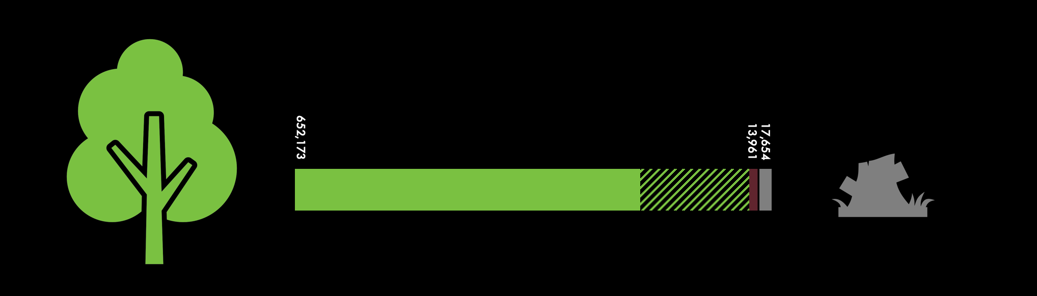
Since there wasn’t a single comprehensive source for plant seasonality, I started with the 2015 NYC Street Tree Census data from NYC OpenData. This impressive dataset was collected by the NYC Department of Parks and Recreation with help from 2,200 citizen mappers, who spent over 12,000 hours surveying nearly every street tree across the city. In total, they recorded 666,134 trees (both living and dead), plus 17,654 stumps. While the census doesn’t include trees in parks or smaller plants, it still offers a detailed look at the greenery people encounter in everyday urban life.
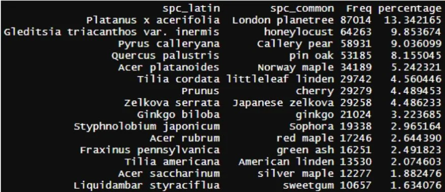
To prepare the dataset, I filtered out the 17,654 stumps and 13,965 dead trees—leaving 652,172 living trees to work with. My next step was to explore how many tree species were included, since identifying their seasonal behaviors (like blooming and leaf-fall) was key to mapping NYC’s color shifts. The dataset revealed 133 unique species.
Ideally, I wanted a source that directly mapped each species to its bloom and leaf-change timings—but I didn’t find that until later in the project (see Discussion). As a result, I focused on the most common and visually impactful species for this initial version of the map.
Utilizing R, I computed the percentage of each species among all trees. The resulting visualization clearly illustrates that certain tree species significantly outnumber others.
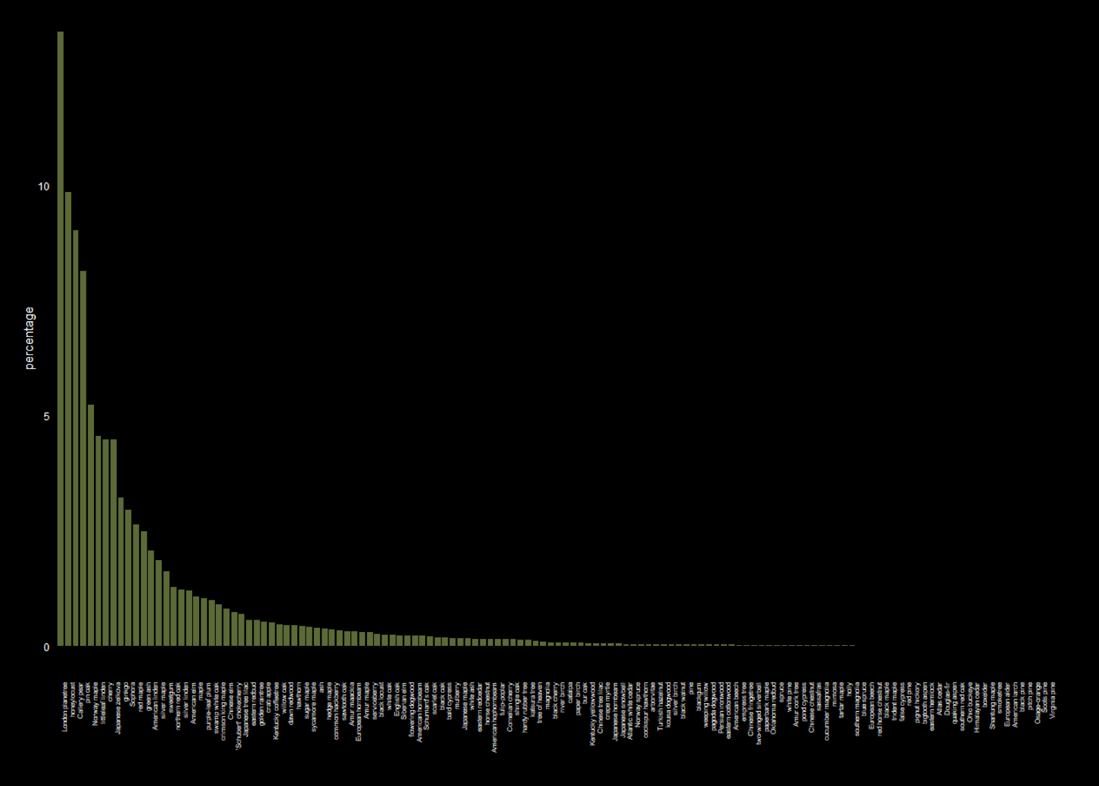
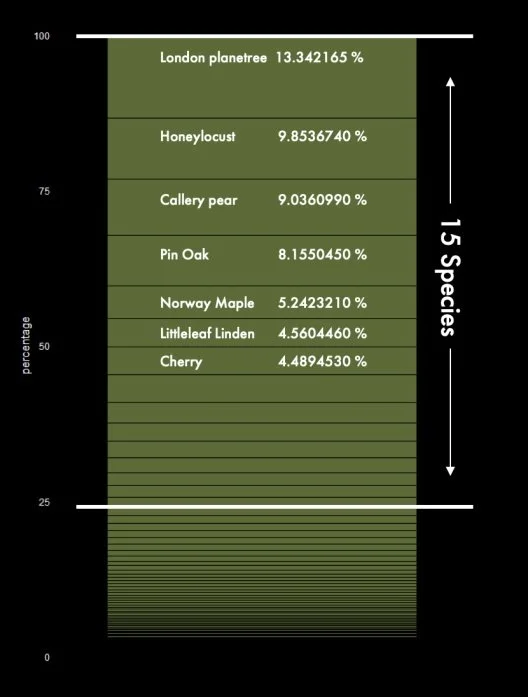
The trend becomes even clearer when viewed vertically. More than 75% of street trees belong to the top 15 dominant species. Notably, 13% of New York street trees are London Planetrees, followed by Honeylocust and Callery Pear. Surprisingly, there are only 29,279 Cherry trees recorded, despite their renowned attractiveness and signature blossoms in New York City. They account for less than 5% of all street trees.
After filtering, we are left with 496,184 trees of 15 species, which became the final dataset size for this mapping project.
Plant species ratio in NYC
Second task is to understand NYC’s seasonal color
First
Since there wasn’t a ready-made dataset tracking tree blossom and leaf-fall patterns, I did a deep dive into how tree colors change throughout the year. To keep things manageable, I focused on 15 of the most common street tree species in NYC.
I started with the Missouri Botanical Garden’s Tree Finder, which includes helpful details like bloom times and flower colors. Some species were labeled as having “insignificant” flowers—usually meaning they’re small or not visually prominent.
To make sure the bloom timing aligned with NYC’s climate, I cross-referenced everything with the NYC Parks Bloom Guide. While it’s organized by month rather than species (making it tricky to navigate), it helped validate local bloom windows and added regional accuracy to my dataset.
Second
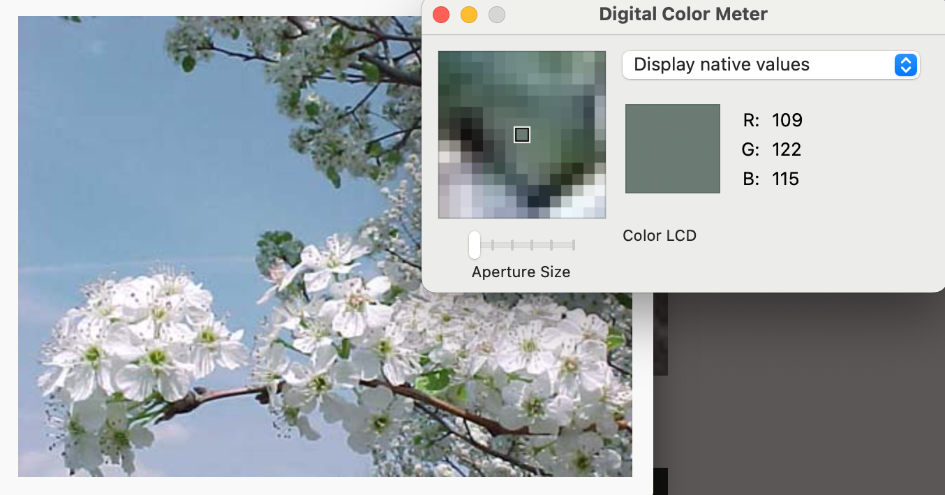
The second task was figuring out the exact color of each flower. While the Tree Finder included descriptions, they were often vague—terms like “greenish-yellow” or “yellowish-green” weren’t helpful for visual design. I needed something more precise.
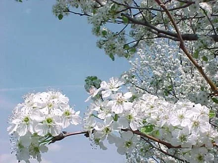
To solve this, I used the Digital Color Meter tool built into macOS. I searched for each tree species by its scientific name on Google Images, then selected photos that clearly showed the flower or fall leaf color. Using the color meter, I sampled areas of each image to get the average RGB values and converted them into hex codes—a more standardized and intuitive format for visualizing color. I also adjusted the tool’s aperture size to capture a broader area of color, ensuring a more balanced representation.
After converting the RGB values into hex codes, I added the monthly color data into the original species table (see below). For fall foliage, I divided autumn into two stages—October/November and December—based on personal observation, since there’s limited research available on exact timing. (More on this in the discussion section.)
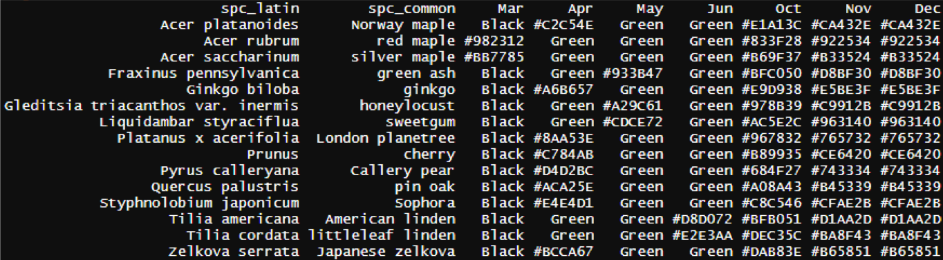
Months not included in the table were deemed to have no significant color changes. During the mapping process, all trees in these months and those not undergoing blooming or leaf-falling were uniformly colored with a shade of green. This was done to accentuate the noteworthy color changes, while still acknowledging the diverse colors of different tree species.
Second task is to understand NYC’s seasonal color
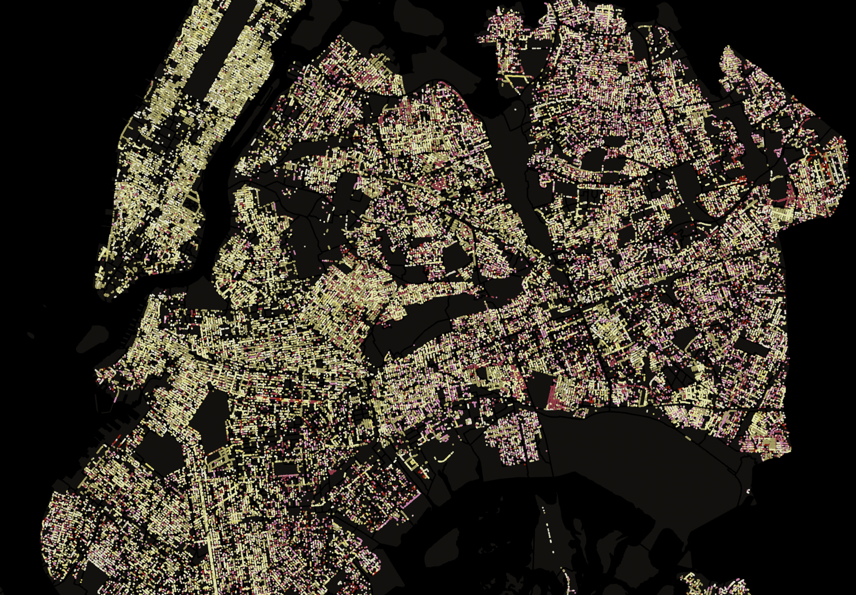
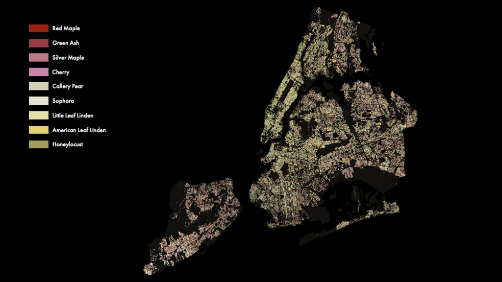
After merging the Tree Census data with the color table in QGIS, I created monthly dot maps to visualize the changing colors of NYC’s street trees. When played in sequence, the maps revealed a dynamic and vibrant progression—bringing the city’s seasonal transformations to life.
However, my expectations for a more vibrant display weren't fully met. One reason was the inclusion of flowers such as Pin Oak, which actually have green or yellowish-green blooms. To enhance the visual impact, I filtered out green and insignificant flowers in the subsequent map, focusing solely on the most visually striking blooms.
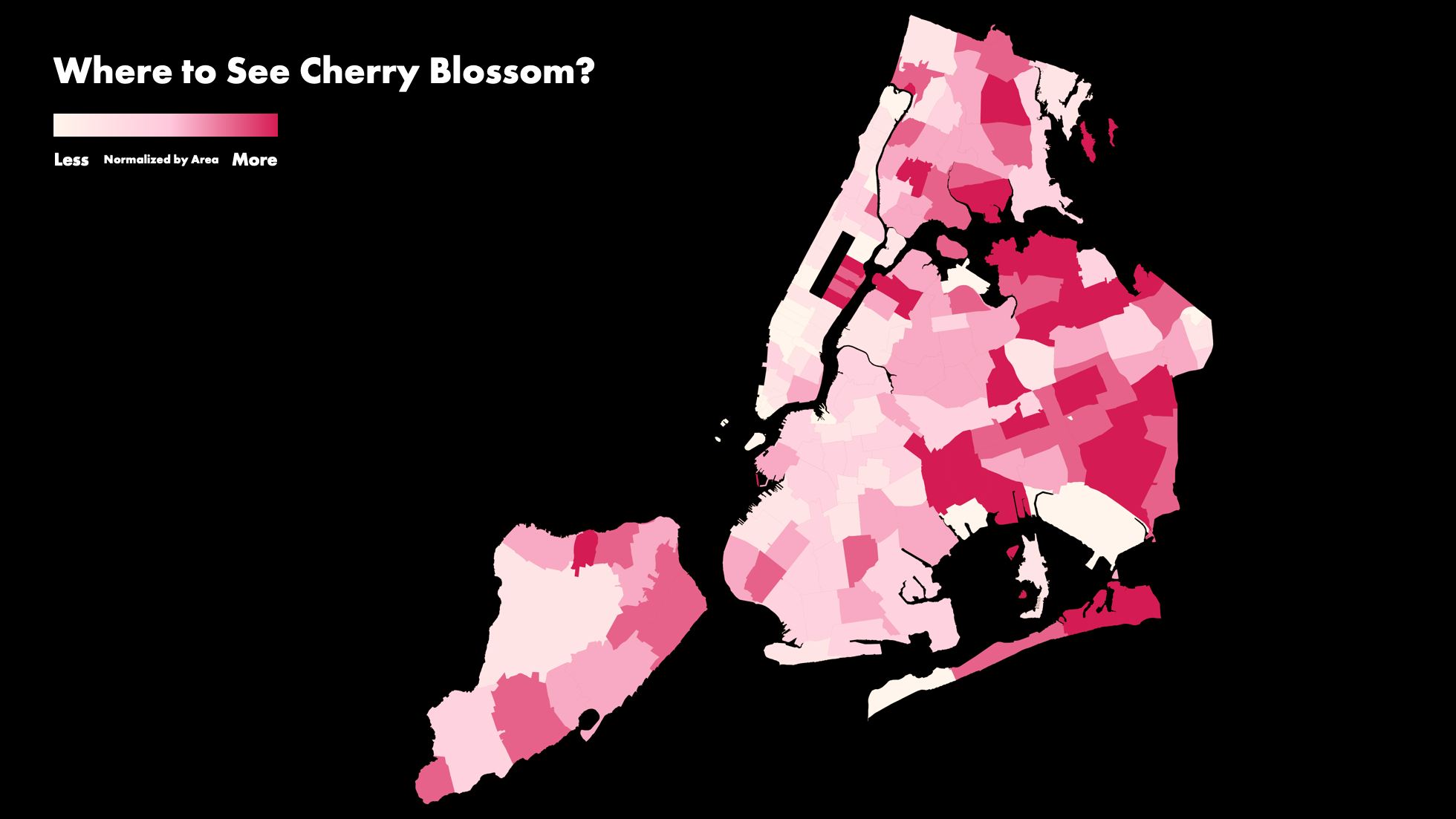
Although visually appealing, the dot maps lacked depth in conveying information. Consequently, I developed choropleth maps to provide a more statistically insightful narrative. The first map addressed the question of cherry blossom sightings outside of parks, showcasing cherry tree density by zip code tabulation area (ZTA). Notably, areas east of Central Park exhibited denser cherry tree populations compared to their western counterparts.
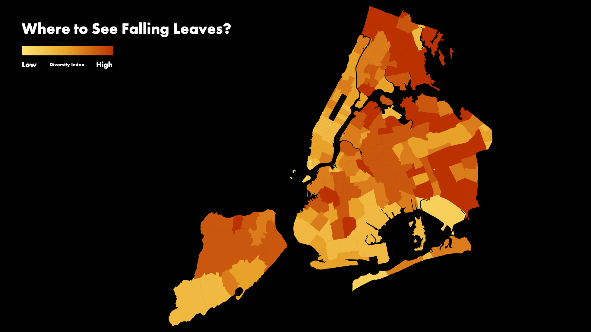
Furthermore, considering the diverse leaf colors of most tree species, I calculated a diversity index for each ZTA to predict areas with a more colorful autumn. This graduated choropleth map doubled as a species diversity representation for NYC's street trees.
Lastly, I devised a hexagon map illustrating the color trend across NYC. Focusing on April, the peak month for blooming, I divided the city into hexagonal zones. While sacrificing species-level details, this map provided clearer insights into overall colorfulness trends.
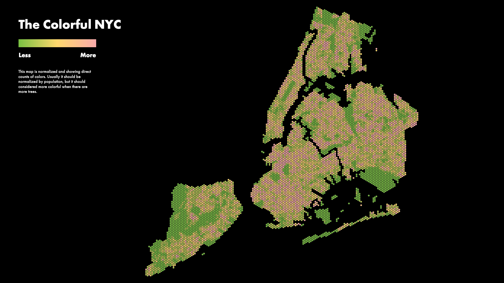
Despite not being population-normalized, the maps offered valuable insights into color distribution. In particular, the normalized map revealed pinker hues in southern Staten Island and adjacent areas to Central Park, suggesting a lower tree density but greater species diversity in these regions.
The Vibrant NYC in 2019: Mapping Street Trees' Blossoms and Defoliation
In my second year living in New York City, I experienced something I’d never seen growing up in southern China and sunny California—true seasons. Autumn exploded in color, and spring followed with blossoms so vivid they seemed to compete for attention. The city's landscape changed week by week, and I was captivated.
This inspired me to create a chronological color map of NYC, showing how the city’s street trees transform throughout the year. The project includes a dot map tracking monthly color changes across the top 15 tree species, along with choropleth maps highlighting the most colorful spots—like where cherry blossoms bloom or where tree diversity peaks.
This project was created as part of my Intro to GIS course at Pratt Institute, taught by Professor Jeremiah Trinidad-Christensen.
Role & Responsibilities
Individual project
Research
Data cleaning
Data visualization
Timeline
3 weeks

First step is to understand the plant species in NYC
Since there wasn’t a single comprehensive source for plant seasonality, I started with the 2015 NYC Street Tree Census data from NYC OpenData. This impressive dataset was collected by the NYC Department of Parks and Recreation with help from 2,200 citizen mappers, who spent over 12,000 hours surveying nearly every street tree across the city. In total, they recorded 666,134 trees (both living and dead), plus 17,654 stumps. While the census doesn’t include trees in parks or smaller plants, it still offers a detailed look at the greenery people encounter in everyday urban life.
To prepare the dataset, I filtered out the 17,654 stumps and 13,965 dead trees—leaving 652,172 living trees to work with. My next step was to explore how many tree species were included, since identifying their seasonal behaviors (like blooming and leaf-fall) was key to mapping NYC’s color shifts. The dataset revealed 133 unique species.
Ideally, I wanted a source that directly mapped each species to its bloom and leaf-change timings—but I didn’t find that until later in the project (see Discussion). As a result, I focused on the most common and visually impactful species for this initial version of the map.
Utilizing R, I computed the percentage of each species among all trees. The resulting visualization clearly illustrates that certain tree species significantly outnumber others.
The trend becomes even clearer when viewed vertically. More than 75% of street trees belong to the top 15 dominant species. Notably, 13% of New York street trees are London Planetrees, followed by Honeylocust and Callery Pear. Surprisingly, there are only 29,279 Cherry trees recorded, despite their renowned attractiveness and signature blossoms in New York City. They account for less than 5% of all street trees.
After filtering, we are left with 496,184 trees of 15 species, which became the final dataset size for this mapping project.
Plant species ratio in NYC
Second task is to understand NYC’s seasonal color
First
Since there wasn’t a ready-made dataset tracking tree blossom and leaf-fall patterns, I did a deep dive into how tree colors change throughout the year. To keep things manageable, I focused on 15 of the most common street tree species in NYC.
I started with the Missouri Botanical Garden’s Tree Finder, which includes helpful details like bloom times and flower colors. Some species were labeled as having “insignificant” flowers—usually meaning they’re small or not visually prominent.
To make sure the bloom timing aligned with NYC’s climate, I cross-referenced everything with the NYC Parks Bloom Guide. While it’s organized by month rather than species (making it tricky to navigate), it helped validate local bloom windows and added regional accuracy to my dataset.
Second
The second task was figuring out the exact color of each flower. While the Tree Finder included descriptions, they were often vague—terms like “greenish-yellow” or “yellowish-green” weren’t helpful for visual design. I needed something more precise.
To solve this, I used the Digital Color Meter tool built into macOS. I searched for each tree species by its scientific name on Google Images, then selected photos that clearly showed the flower or fall leaf color. Using the color meter, I sampled areas of each image to get the average RGB values and converted them into hex codes—a more standardized and intuitive format for visualizing color. I also adjusted the tool’s aperture size to capture a broader area of color, ensuring a more balanced representation.
After converting the RGB values into hex codes, I added the monthly color data into the original species table (see below). For fall foliage, I divided autumn into two stages—October/November and December—based on personal observation, since there’s limited research available on exact timing. (More on this in the discussion section.)
Months not included in the table were deemed to have no significant color changes. During the mapping process, all trees in these months and those not undergoing blooming or leaf-falling were uniformly colored with a shade of green. This was done to accentuate the noteworthy color changes, while still acknowledging the diverse colors of different tree species.
Exploring colorful patterns in NYC's street trees through mapping
After merging the Tree Census data with the color table in QGIS, I created monthly dot maps to visualize the changing colors of NYC’s street trees. When played in sequence, the maps revealed a dynamic and vibrant progression—bringing the city’s seasonal transformations to life.
However, my expectations for a more vibrant display weren't fully met. One reason was the inclusion of flowers such as Pin Oak, which actually have green or yellowish-green blooms. To enhance the visual impact, I filtered out green and insignificant flowers in the subsequent map, focusing solely on the most visually striking blooms.
Although visually appealing, the dot maps lacked depth in conveying information. Consequently, I developed choropleth maps to provide a more statistically insightful narrative. The first map addressed the question of cherry blossom sightings outside of parks, showcasing cherry tree density by zip code tabulation area (ZTA). Notably, areas east of Central Park exhibited denser cherry tree populations compared to their western counterparts.
Furthermore, considering the diverse leaf colors of most tree species, I calculated a diversity index for each ZTA to predict areas with a more colorful autumn. This graduated choropleth map doubled as a species diversity representation for NYC's street trees.
Lastly, I devised a hexagon map illustrating the color trend across NYC. Focusing on April, the peak month for blooming, I divided the city into hexagonal zones. While sacrificing species-level details, this map provided clearer insights into overall colorfulness trends.
Despite not being population-normalized, the maps offered valuable insights into color distribution. In particular, the normalized map revealed pinker hues in southern Staten Island and adjacent areas to Central Park, suggesting a lower tree density but greater species diversity in these regions.